Pyntekvister don’t exist to impress design blogs. They exist to fix boring rooms, awkward corners, and interiors that feel flat no matter how much furniture you move around. When used well, they carry weight without shouting. When used badly, they look like dead sticks in a vase. The difference isn’t money or taste level. It’s restraint, placement, and knowing when to stop.
People who dismiss pyntekvister as a trend usually haven’t lived with them long enough. They aren’t decoration in the traditional sense. They’re structure. They create lines where walls feel empty and height where rooms feel squat. That’s why they keep showing up in Scandinavian homes year after year, quietly doing their job.
Why pyntekvister outperform most decorative objects
Most décor items compete for attention. Bowls, sculptures, trays, candles—they all demand space and visual priority. Pyntekvister don’t. They shape a room instead of filling it.
A single arrangement can pull the eye upward in a low-ceilinged apartment. It can soften the edge of a concrete wall. It can break the stiffness of modern furniture without dragging the space toward rustic clichés. That balance is hard to achieve with manufactured objects.
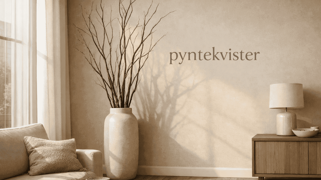
Another reason pyntekvister work is scale. They don’t sit politely on shelves. They lean, stretch, and sometimes bend. That vertical presence is rare in home décor, and it’s exactly what many rooms lack.
Choosing branches that don’t look accidental
The fastest way to ruin pyntekvister is to treat them casually. Random sticks shoved into a vase read as unfinished, not natural.
Branch choice matters more than container choice. Birch brings lightness and calm. Willow introduces movement and softness. Cherry branches feel deliberate even when bare. Pine adds tension and weight, especially in winter interiors. Mixing species rarely works unless there’s a strong visual reason.
Thickness matters too. Thin twigs disappear. Overly thick branches dominate. The sweet spot sits somewhere between visible structure and negative space. You want the eye to follow the lines, not trip over them.
Pyntekvister should look chosen, not collected five minutes before guests arrive.
Placement rules designers rarely spell out
Corners are overrated. Yes, pyntekvister can fix dead corners, but that’s the obvious move. Better placements exist.
Next to windows, branches interact with daylight and shadow. Against blank walls, they create rhythm without artwork. Near staircases, they echo vertical motion already happening in the space.
Avoid symmetry. Two identical arrangements flanking a doorway flatten the effect. Pyntekvister work because they feel organic, not staged. Let them lean slightly. Let one branch break the invisible frame.
Floor-level arrangements outperform tabletop ones almost every time. Height is their advantage. Don’t waste it.
Seasonal shifts without seasonal kitsch
Pyntekvister adapt to seasons without becoming themed décor, which is rare. That adaptability is their real strength.
Spring arrangements thrive on buds and early growth. You don’t need blossoms everywhere. A few swelling tips suggest change without shouting it. Summer calls for restraint. Green branches paired with simple containers feel calm, not decorative.
Autumn is where many people overdo it. Dried leaves, color overload, clutter. One branch with subtle color beats a bundle every time. Winter strips everything back. Bare pyntekvister paired with light, shadow, or subtle illumination carry more atmosphere than wreaths ever will.
The key is editing. Seasonal doesn’t mean decorative excess.
Real wood versus artificial branches: an honest comparison
Real pyntekvister age. They dry, change color, crack slightly. That’s part of their appeal. Artificial branches stay frozen in time, which can be useful but often reads as lifeless up close.
Artificial options work best in commercial spaces or homes where maintenance is impossible. Even then, quality matters. Cheap plastic ruins the entire point.
If you’re choosing artificial pyntekvister, look for irregularity. Perfect symmetry is the giveaway. Slight bends, uneven texture, muted color—those details decide whether the arrangement works or fails.
At home, real branches win unless there’s a strong reason not to use them.
Containers that support instead of compete
The container should disappear. If the vase steals attention, the balance is off.
Tall ceramic cylinders, rough stone, muted glass—these hold pyntekvister without narrating the arrangement. Glossy finishes can work, but only when the branches are understated.
Avoid narrow-necked vases that force branches into unnatural shapes. Let gravity and form decide the spread. Weight at the base matters too. Top-heavy arrangements that wobble kill confidence fast.
The container exists to support the branches. Nothing more.
Pyntekvister in small spaces where nothing else works
Small apartments punish bad décor choices. There’s no room to hide mistakes. Pyntekvister shine here because they occupy air, not floor.
A single floor arrangement can replace multiple small objects that clutter shelves. In studio apartments, branches help define zones without walls. Near entryways, they signal arrival without furniture.
The mistake is going too big. One strong vertical gesture beats an oversized bundle fighting the ceiling. Measure twice. Trim once. Editing saves small spaces.
Events and temporary spaces: where restraint matters most
Weddings and events love pyntekvister for a reason. They photograph well and scale easily. That popularity also leads to abuse.
Overdecorated branches covered in ornaments, ribbons, or flowers lose their edge. The most effective event uses keep them raw or lightly enhanced. Lighting does more than adornment ever will.
Tall arrangements create drama without blocking sightlines. That’s why planners return to pyntekvister again and again. They solve spatial problems without introducing new ones.
Maintenance, or why neglect sometimes works better
Pyntekvister don’t need fussing. That’s part of their appeal. Dust them occasionally. Rotate them if light exposure changes color unevenly.
Watering is rarely required unless buds are present. Even then, minimal care works best. Overhandling leads to breakage and forced shapes.
Let branches age naturally. Replace them when they stop contributing. Decoration doesn’t need permanence to feel intentional.
When pyntekvister fail and why that’s useful
Not every space needs them. Busy rooms already heavy with texture don’t benefit from more lines. Cluttered interiors turn pyntekvister into visual noise.
Failure here is a signal, not a mistake. It tells you the room needs subtraction, not addition. That’s valuable information.
Design choices should respond to space, not habits.
The takeaway that matters
Pyntekvister aren’t about nature, trends, or minimalism. They’re about discipline. Choosing fewer elements and letting them do more work. When they succeed, they don’t announce themselves. They quietly fix what feels off.
If your space feels flat, look up. Height, line, and air solve problems furniture never will. That’s where pyntekvister earn their place.
FAQs
How tall should pyntekvister be for a standard ceiling?
Aim for two-thirds of the wall height. Shorter looks timid, taller feels forced unless the ceiling is high.
Can pyntekvister work in colorful interiors?
Yes, but only if the branches are neutral. Color on color creates conflict fast.
Is it better to group branches tightly or let them spread?
Loose spreads read intentional. Tight bunches feel like storage, not decoration.
How often should pyntekvister be replaced?
When they stop adding structure. That might be months or years. There’s no schedule.
Do pyntekvister work with traditional furniture?
They do, as long as the arrangement stays simple. Ornate rooms need calm elements, not more detail.